
The world map most of us recognize instantly does not show countries and continents at their truest size. For centuries, the Mercator projection has influenced how we picture the planet, making some northern regions appear much larger while shrinking the visual importance of places closer to the equator.
The United Nations General Assembly has backed a resolution encouraging wider use of equal-area maps, underscoring a shift toward more accurate global representation. The resolution received 164 votes in favor, with the United States voting against it and six countries abstaining. While it does not legally require countries to replace existing maps, it could influence how the world is represented in education, institutions, and technology.
Why Does The Mercator Map Distort The World?
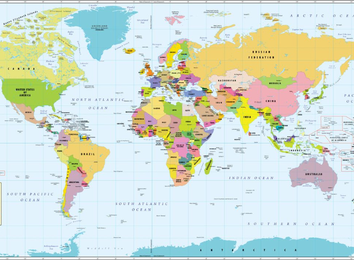
The Mercator projection was created by Flemish cartographer Gerardus Mercator in 1569, primarily for navigation, but its lasting influence has shaped how the world is seen. It allowed sailors to plot a constant compass direction as a straight line, making route planning much easier. However, the projection increasingly exaggerates land areas toward the poles, which is why the scale issue matters. Some of the most striking comparisons include:
- Africa: Covers around 30.3 million square kilometers and is roughly 14 times the area of Greenland, highlighting the scale differences that Mercator can obscure.
- Greenland: Covers only around 2.2 million square kilometers, which helps explain why it can look far larger on Mercator maps than it really is.
- Europe: Covers approximately 10.2 million square kilometers, around a third of Africa’s area, even though conventional maps can make the gap seem smaller.
- South America: Covers approximately 17.8 million square kilometers, yet it can still appear smaller than its true relative size on Mercator maps.
- India: Appears slightly larger on Equal Earth than it does on the familiar Mercator projection.
Planning a trip to Europe? Here’s which airline is best to fly from India to Europe in 2026, along with options worth considering before booking your flight.
What Is The Equal Earth Projection?
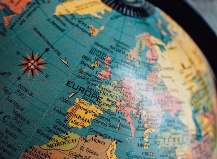
Introduced in 2018 by cartographers Bojan Šavrič, Tom Patterson, and Bernhard Jenny, Equal Earth is designed to preserve the relative surface areas of countries and continents while keeping their shapes reasonably recognizable. In direct contrast to Mercator, it offers a clearer sense of how the world compares in size. If you place Equal Earth and Mercator side by side, the difference is immediately noticeable. Africa and South America occupy considerably more visual space, while Europe and North America appear smaller. Areas near the poles also lose much of the exaggerated scale seen on Mercator.
Looking for travel inspiration? Discover the top 10 most attractive cities in the world in 2026 and see which destinations deserve a place on your travel list.
What Does The New Map Mean For Travelers?
Maps often influence our first impression of how far apart destinations are, so a more realistic sense of geographical scale can change how travelers plan itineraries. This is particularly important when planning trips across large countries or continents.
- Africa: Morocco, Kenya, South Africa, and Zanzibar may all fall under an “Africa trip,” but traveling between them still involves enormous distances.
- South America: Brazil, Colombia, Peru, the Andes, and Patagonia stretch across a continent covering nearly 18 million square kilometers.
- Australia: Sydney, Melbourne, Perth, Cairns, and Uluru are far from each other and not easily included in a compact itinerary.
- Europe: Its relatively compact geographical size helps explain why multi-country trips are often easier to plan than across larger continents.
What Does It Mean For India?
India covers approximately 3.29 million square kilometers, and the Equal Earth projection provides a clearer sense of its scale. This scale matters for travelers because the distances between the Himalayas, Rajasthan, Kerala, Northeast India, and the Andaman and Nicobar Islands already demonstrate how large and geographically diverse the country is. India supported the UN resolution while clarifying that its vote did not amount to an endorsement of any particular projection. It also reiterated the importance of accurately depicting India’s sovereign boundaries on maps.
Searching for a peaceful escape? Here are the quietest countries in the world, with Bhutan topping the list, for travelers looking for a calmer vacation.
Is Equal Earth A Perfect Map?
Equal Earth is more accurate when comparing land areas, but it is not a perfect representation of the planet. The central point is that no flat map can preserve area, shape, distance, and direction simultaneously because the Earth is spherical.
- Mercator: Particularly useful for direction and traditional navigation but distorts area.
- Equal Earth: Preserves relative land area while keeping shapes recognizable.
- Peters projection: Also preserves area but creates more noticeable distortions in the shapes of countries and continents.
Each projection, therefore, serves a different purpose rather than providing a single perfect representation of Earth.
Planning an affordable European getaway? Explore the top 5 cheapest countries to visit from India in 2026 and find destinations that can help you experience Europe on a budget.
Summing Up
The UN-backed push toward equal-area maps does not change the size of the world, but it can change how we understand it. Africa has always been roughly 14 times the size of Greenland, while South America and India have always been larger relative to Greenland than conventional maps might suggest.
For travelers, this new perspective is a useful reminder that a map is only the beginning of understanding a destination. Viewing the world at a more realistic scale makes it easier to appreciate just how much ground separates the places we hope to explore.